Evolution of the Android brand to make it more modern and inclusive. The work spans the entire brand experience: from brand architecture and strategy, to a robust identity system with comprehensive guidelines and partner assets to a fully reimagined mobile-first digital experience on android.com.
Android Rebrand
Role
Brand Design
Agency
Huge Inc
Client
Year
2019
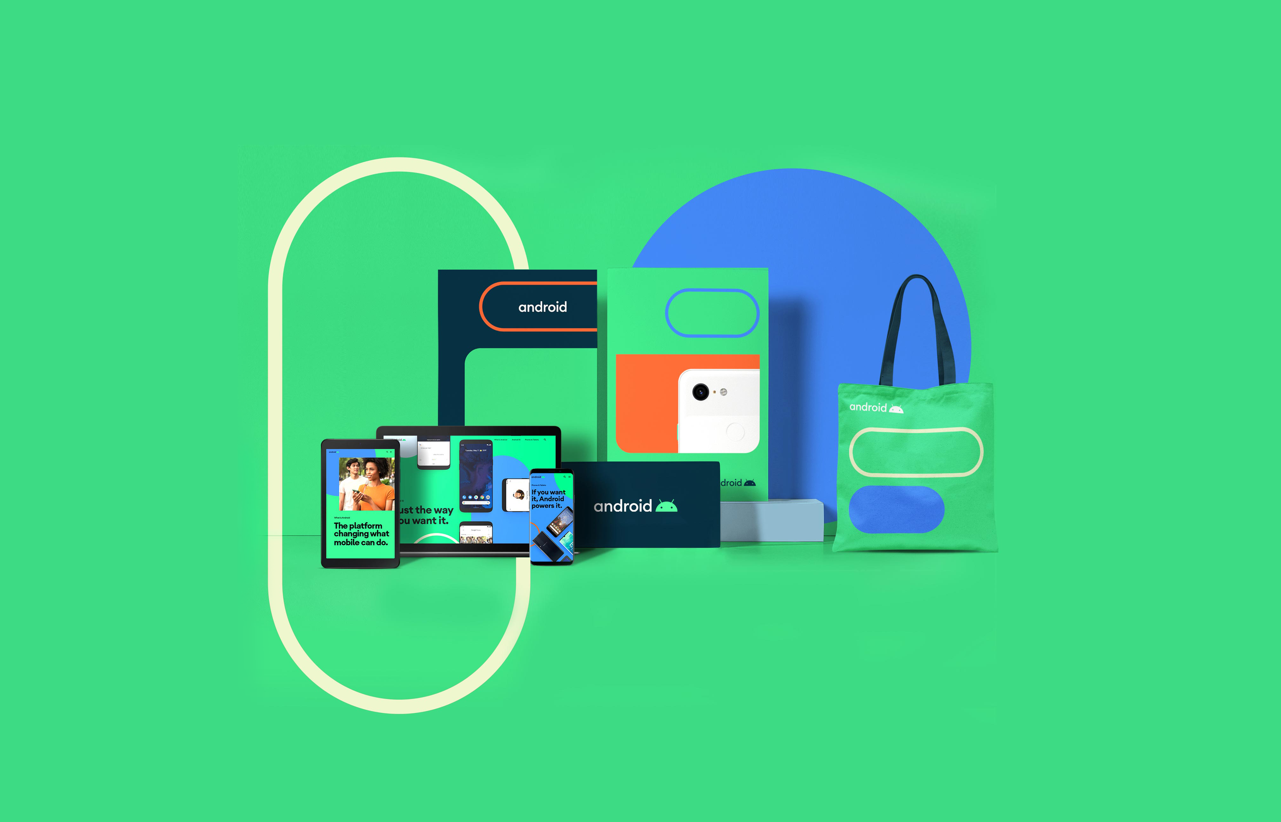
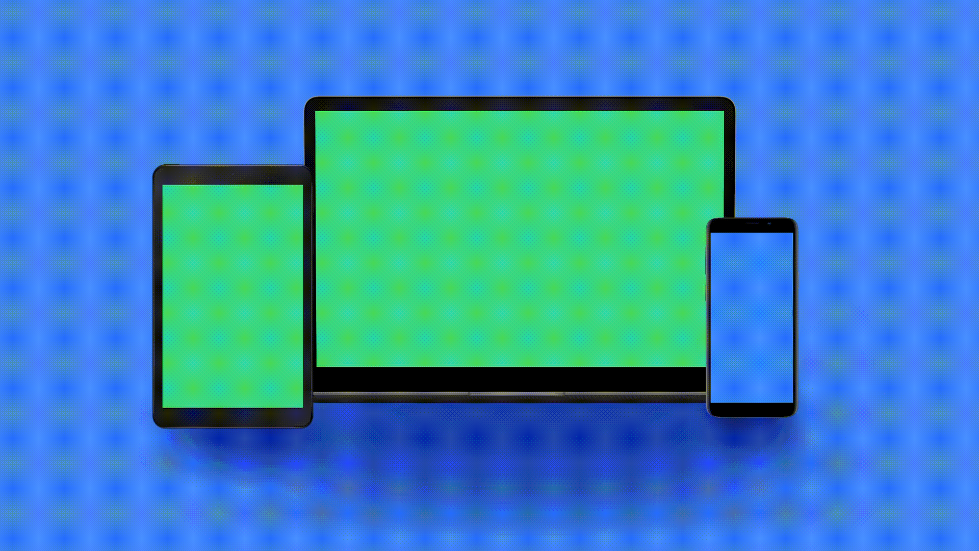
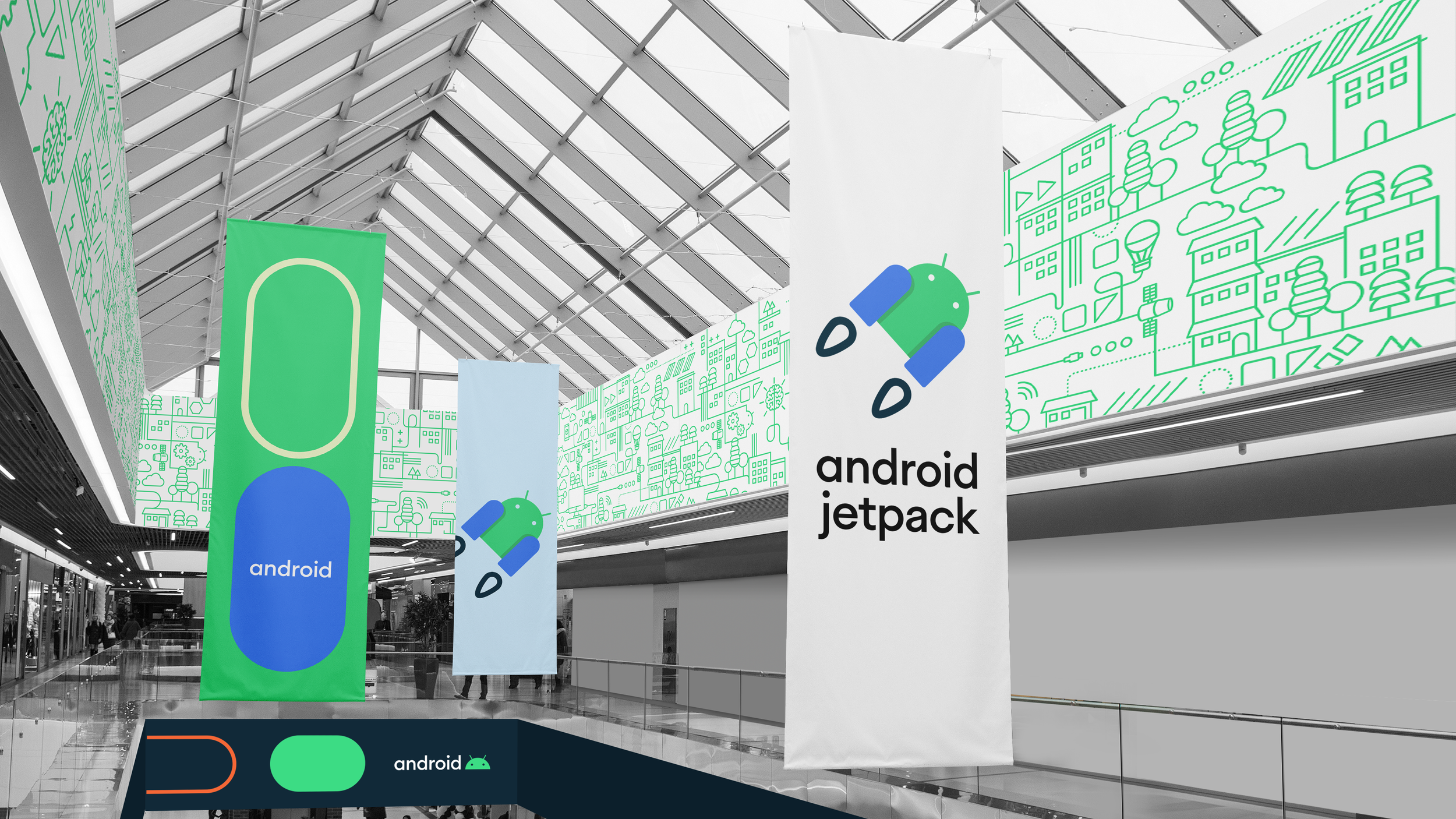
Expansion of the brand system in different formats and environments. Definition of the brand rules and creation of the brand guidelines.
Recognitions: One Show, Art Directors Club, Clio Awards.

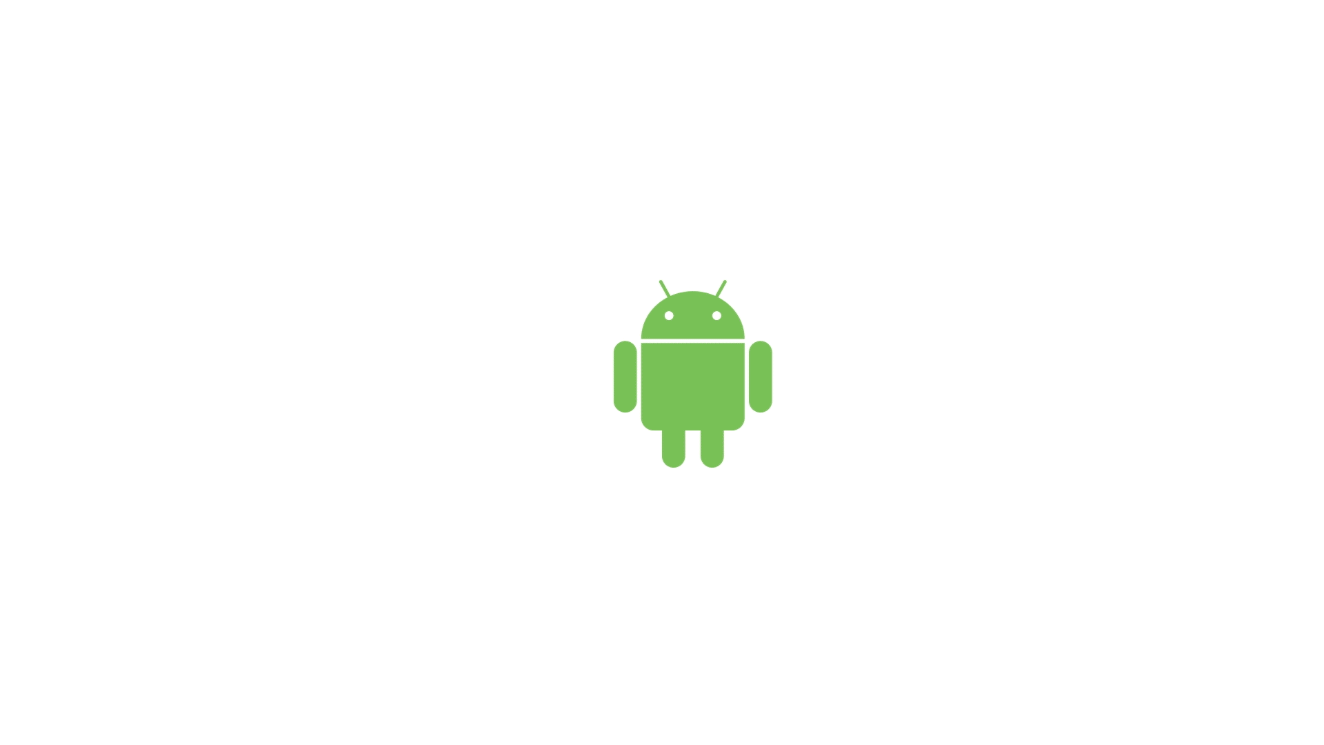
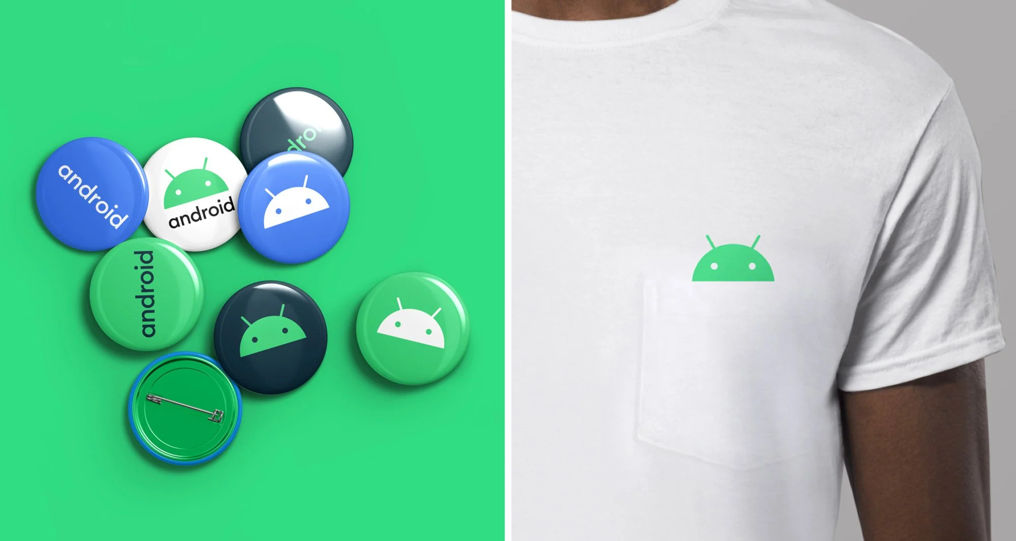
The design of the logo draws inspiration from the most recognizable non-human member of the community, the Android robot. The robot belongs to everyone in the community, and has long been a symbol of the fun and curiosity at the heart of Android.
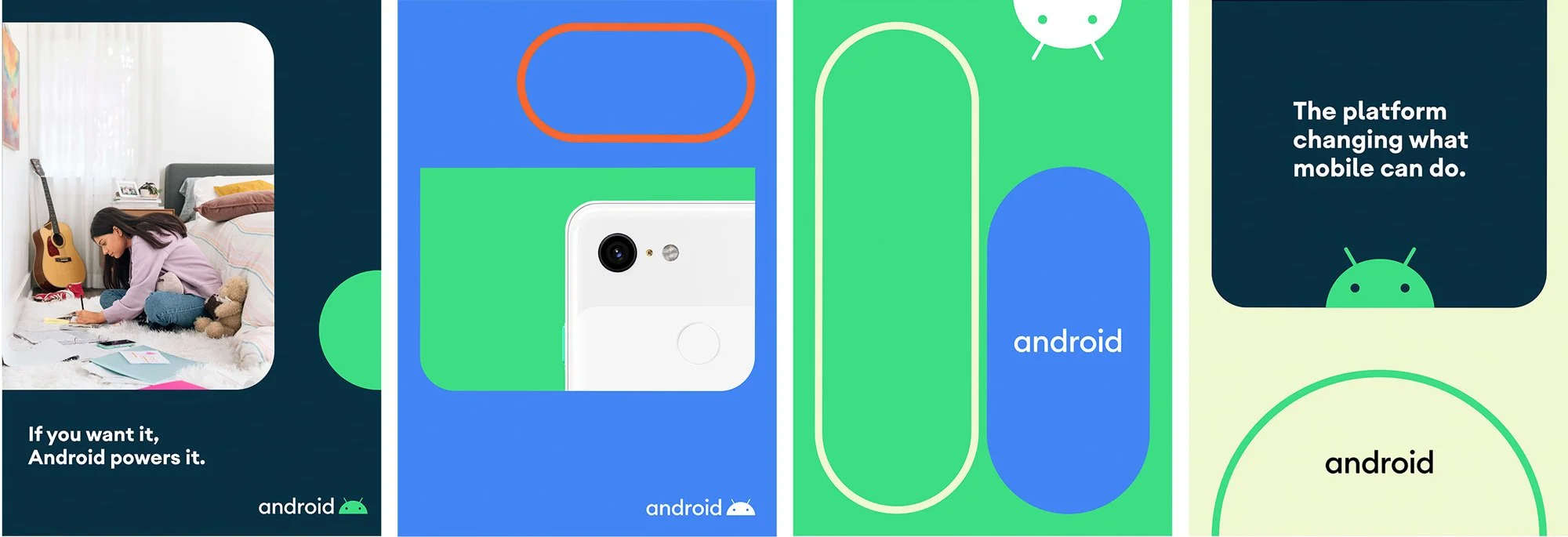

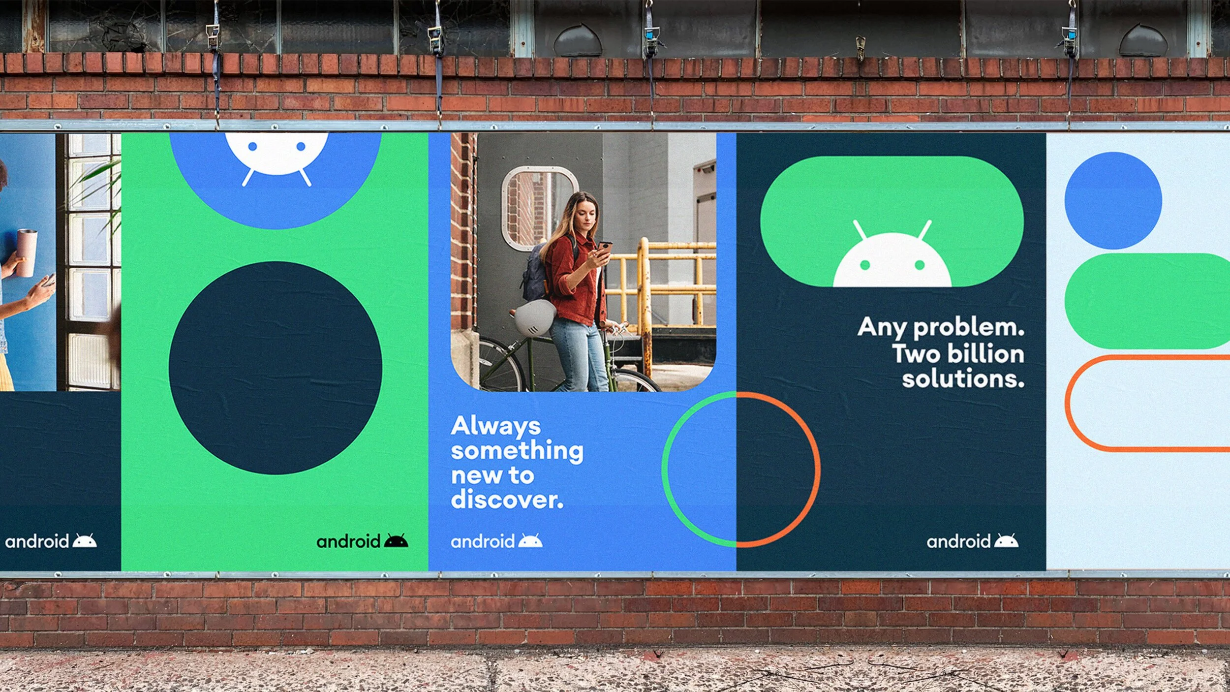
The identity revolves around a set of expanding, roving button-like shapes in both stroked and filled styles that even though they are fairly basic they expand quite nicely into a full visual language that feels playful and dynamic.
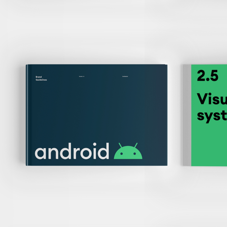
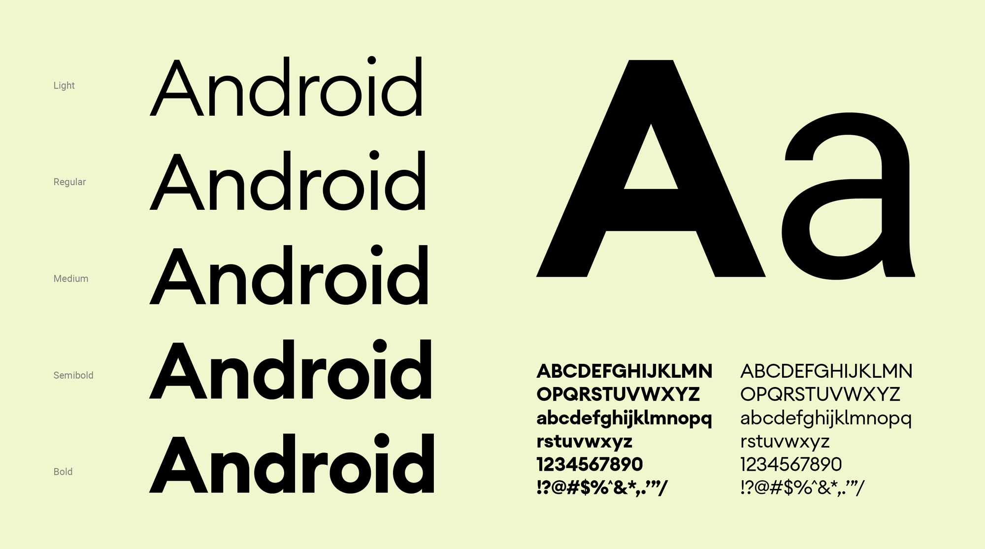
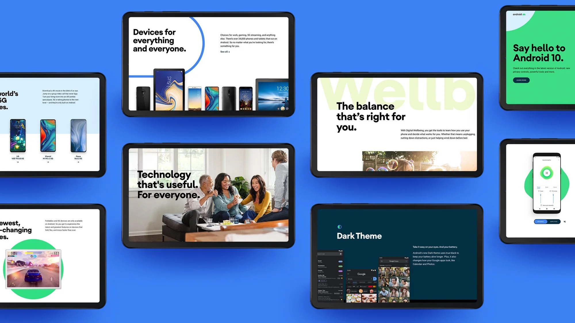
A complete set of guidelines was created with a thoughtful work of definition of the brand rules. These rules covered all brand potential behaviors in different combinations of imagery, graphic elements, and content, also having into consideration these interactions in digital products.
The Android rebrand was an opportunity to rethink the Android developer ecosystem brand and design architecture. The developer brands state was incohesive & had unequal equity.
Android Developers
Role
Brand Design
Illustration
Creative Direction
Agency
Huge Inc
Client
Year
2020
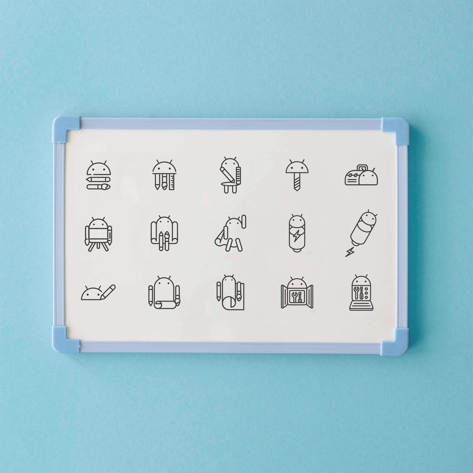
Lead design on the creation/illustration of the Android Developers suite logos, brand ecosystem and brand guidelines.
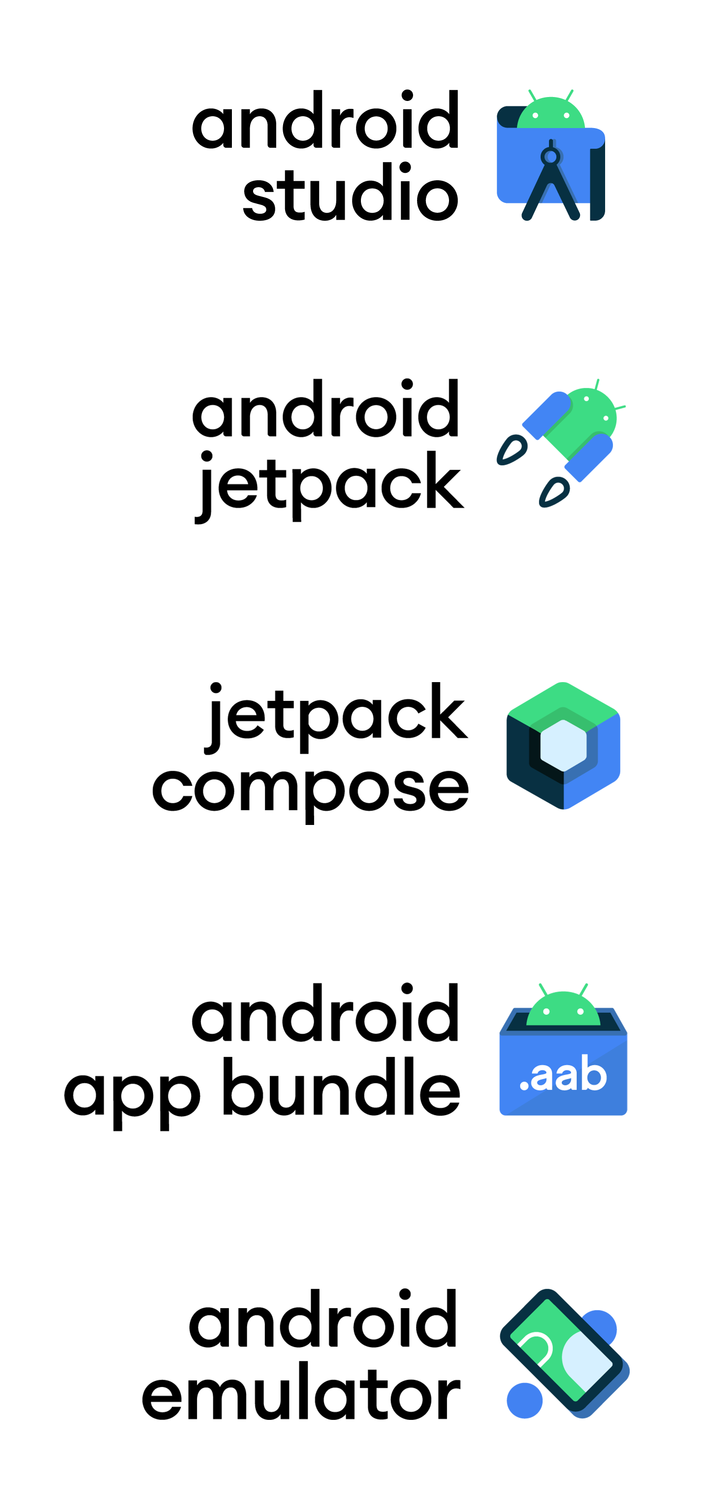
The team worked in multiple iterations for the initial logo concepts. For the client was vital that the illustrations communicate the functionality of each product by being as simple as possible to ensure its visibility.