Pantone Color of
the Year 2023
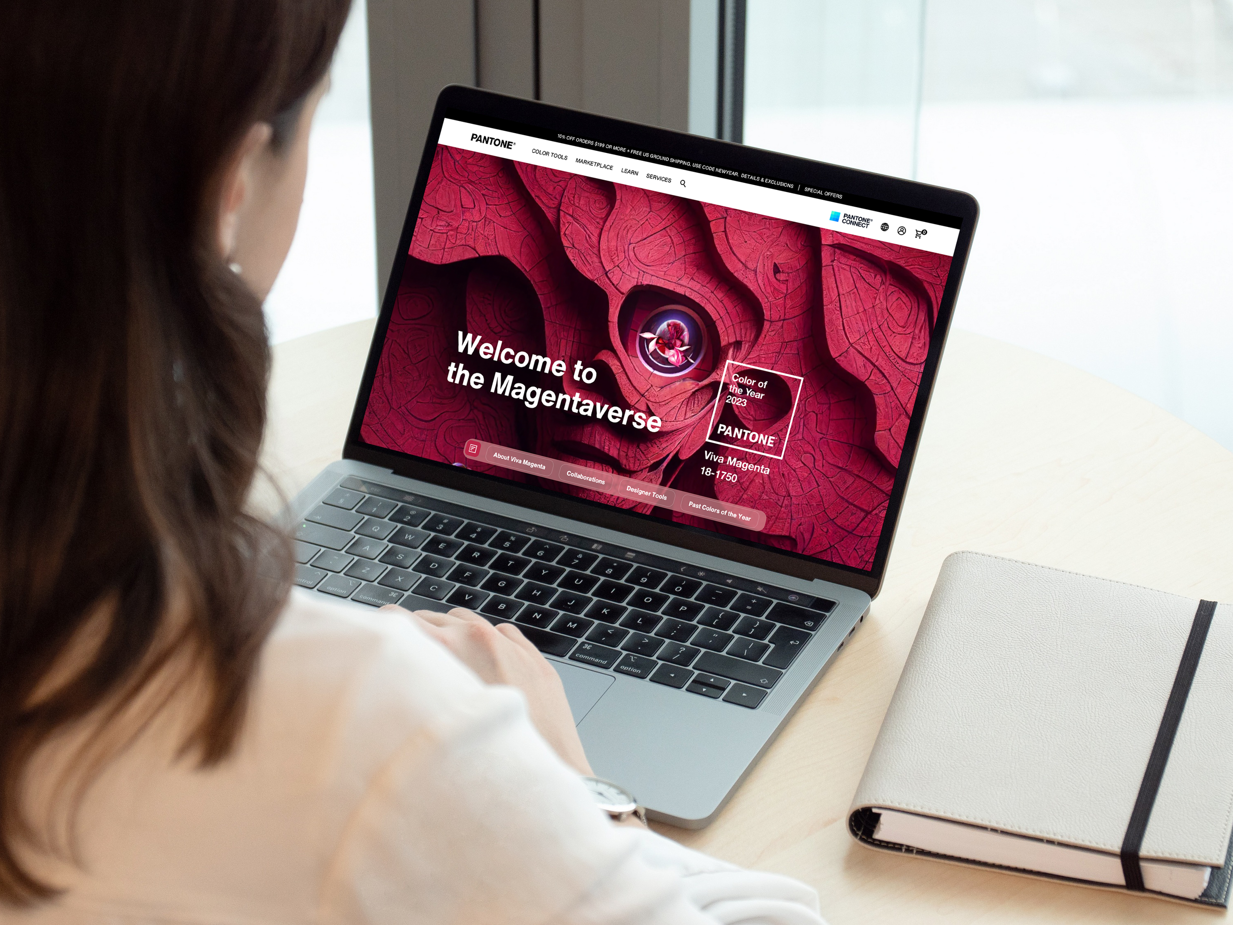
Pantone’s Color of the Year, Viva Magenta 18-1750, vibrates with vim and vigor. It is a shade rooted in nature descending from the red family and expressive of a new signal of strength. Viva Magenta is brave and fearless, and a pulsating color whose exuberance promotes a joyous and optimistic celebration, writing a new narrative.
This year’s Color of the Year is powerful and empowering. It is a new animated red that revels in pure joy, encouraging experimentation and self-expression without restraint, an electrifying, and a boundary-less shade that is manifesting as a stand-out statement. PANTONE 18-1750 Viva Magenta welcomes anyone and everyone with the same verve for life and rebellious spirit. It is a color that is audacious, full of wit and inclusive of all.
Role
Creative Direction
Visual Design
Experience Design
Agency
Huge Inc
Client
Pantone
Year
2022
Ideation, conceptualization and execution of the hero image for the Color of the Year 2023. Storytelling behind the ideas and strategic design of the visuals.
After the client delivered their manifesto, I went through the content to evaluate the best strategic way to tackle this visual challenge. To understand better to where we needed to move forward I started to ask the Who, Where, How and most importantly: Why.
Who.
Unconventional
Brave
Fearless
Empowering
Audacious
Unexpected
Assertive
Stand-out
How.
Vibrating
Vigor
Exuberance
Celebration
Electrifying
Strength
Enthusiastic
Animated
Where.
Transformative reality
Technologic future
Nature
Hybrid (real/digital)
Boundary-less world
Experimentation
Dynamic
Multi-dimensional
Why.
To be optimistic
To be inclusive
Well-being
To offer identity
Be self-expressive
Be joyful
Be creative
Recover ingenuity
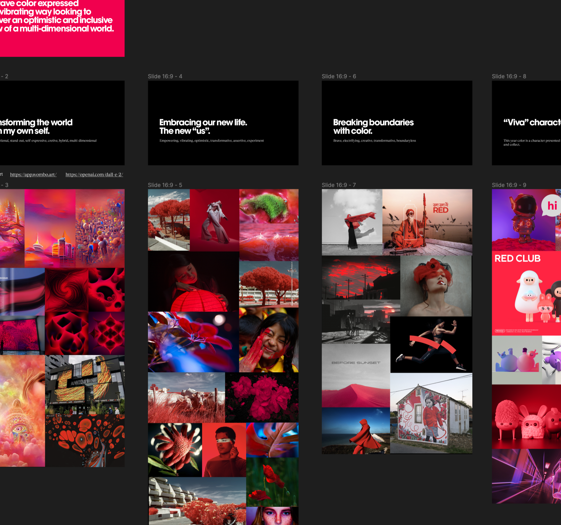
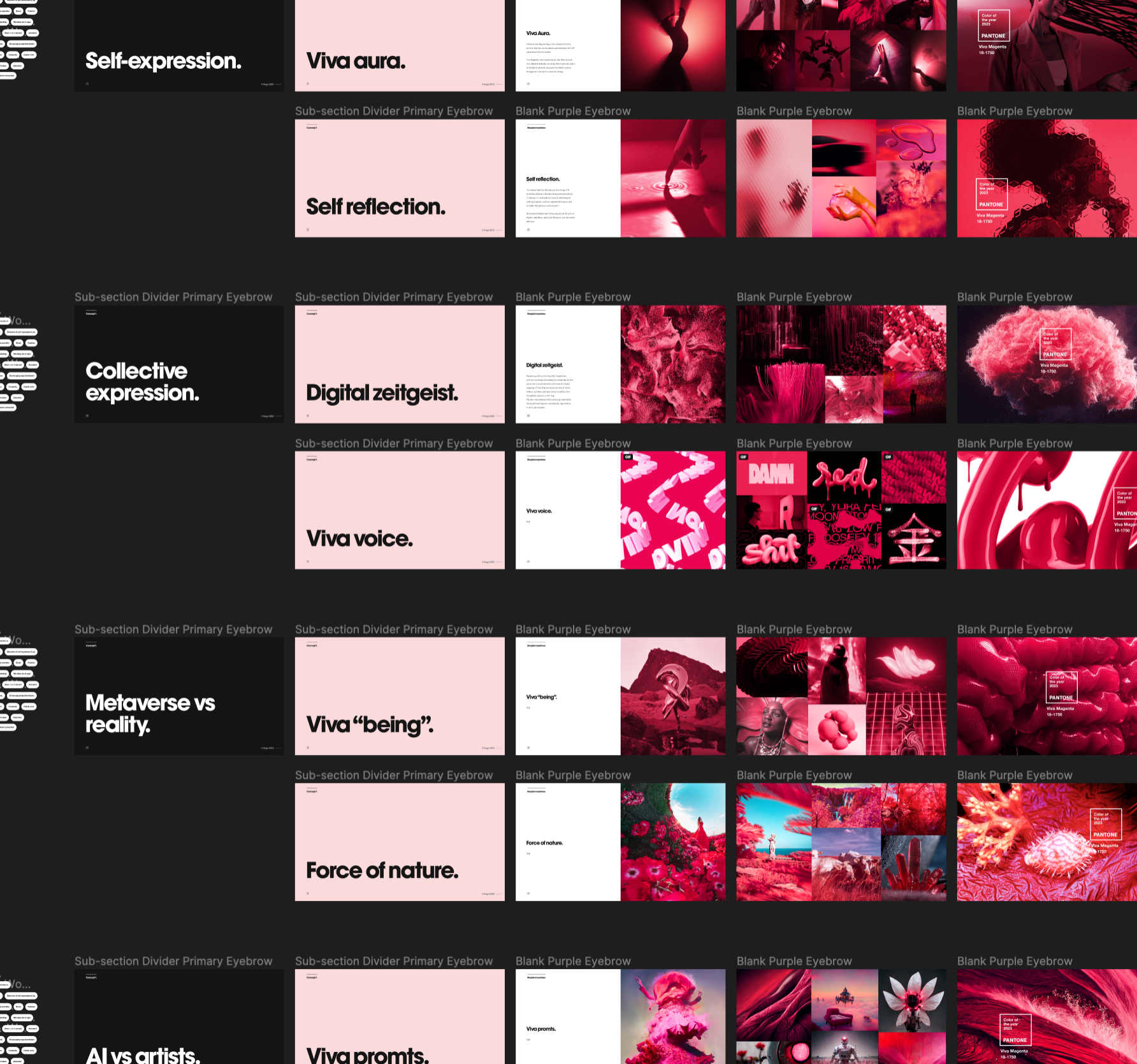
It was very important for the team to be sure to explore a significant amount of concepts that could tell the client rational for the color in a disruptive, creative way.
We explored ideas such as making the color a living character who you can experiment with, a voice expressed in different typographies, a cloud of data and a collaboration between design and AI (Midjourney).
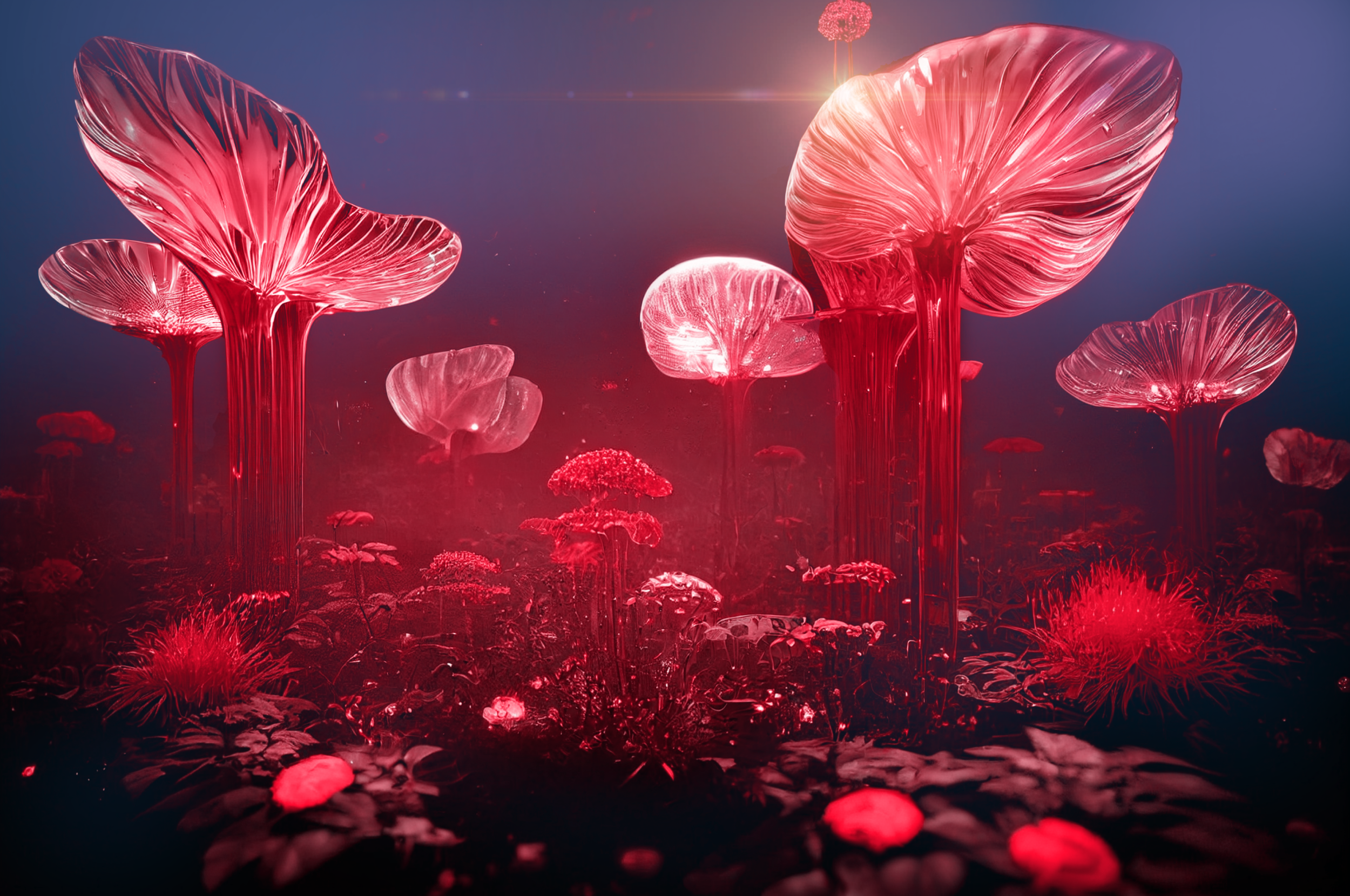
The client loved the idea of thinking of a nature world created by technology and humanity: a collaboration between designers and AI where boundaries are blurry and are not quite clear where reality ends and virtuality begins: The Magentaverse.
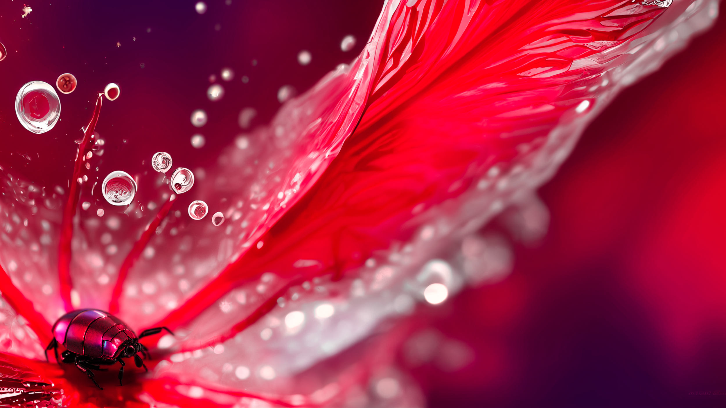
All this enforced by the fact that the color Viva Magenta is inspired by the red of cochineal beetle, one of the most precious dyes belonging to the natural dye family as well as one of the strongest and brightest the world has known.
From there, the exploration was endless. A joined work between designers and Midjourney, thinking in the right propmts to build the right landscapes, textures, and environments. And designers retouching color, blending images together and adding elements. It was a totally new and fun process.
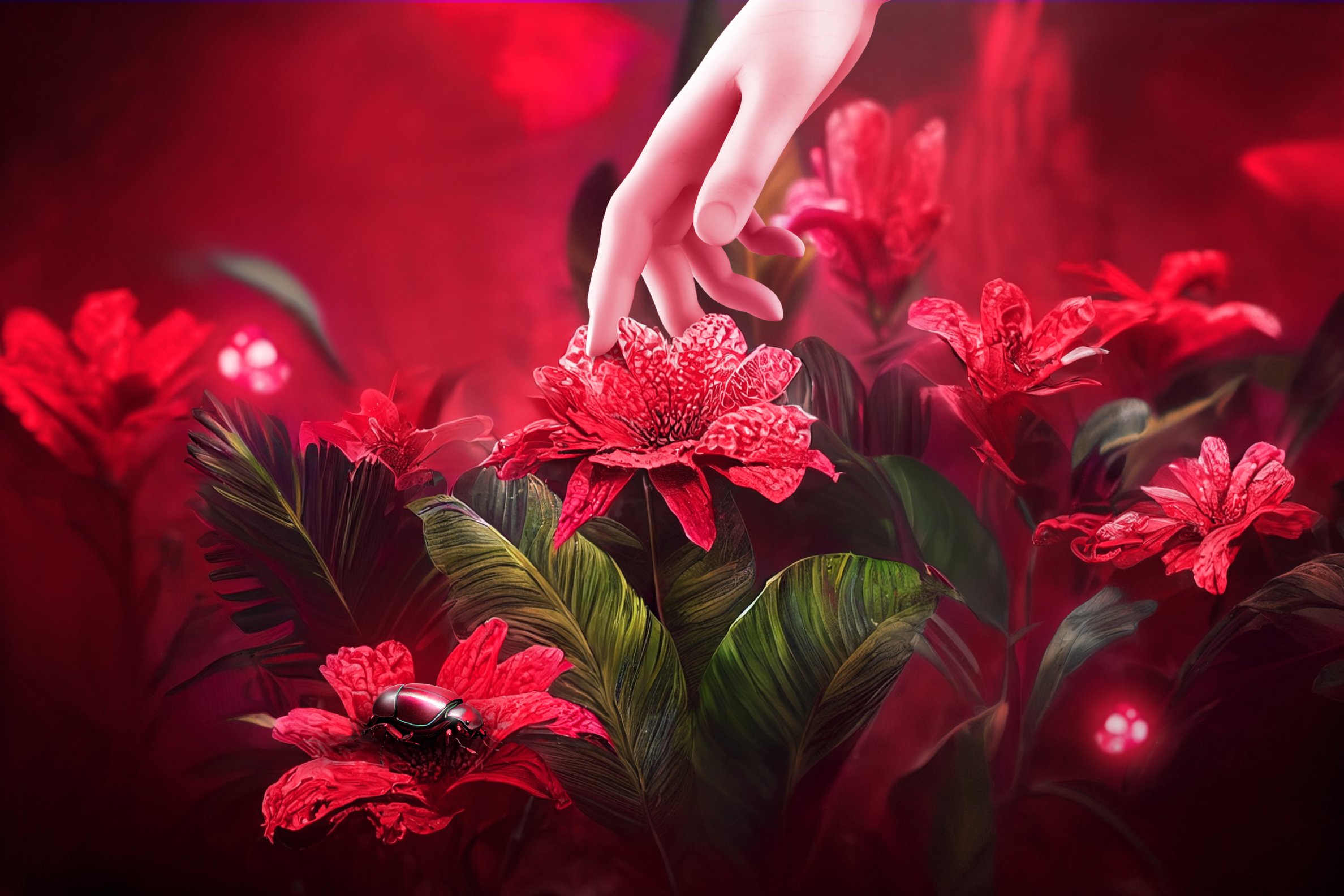
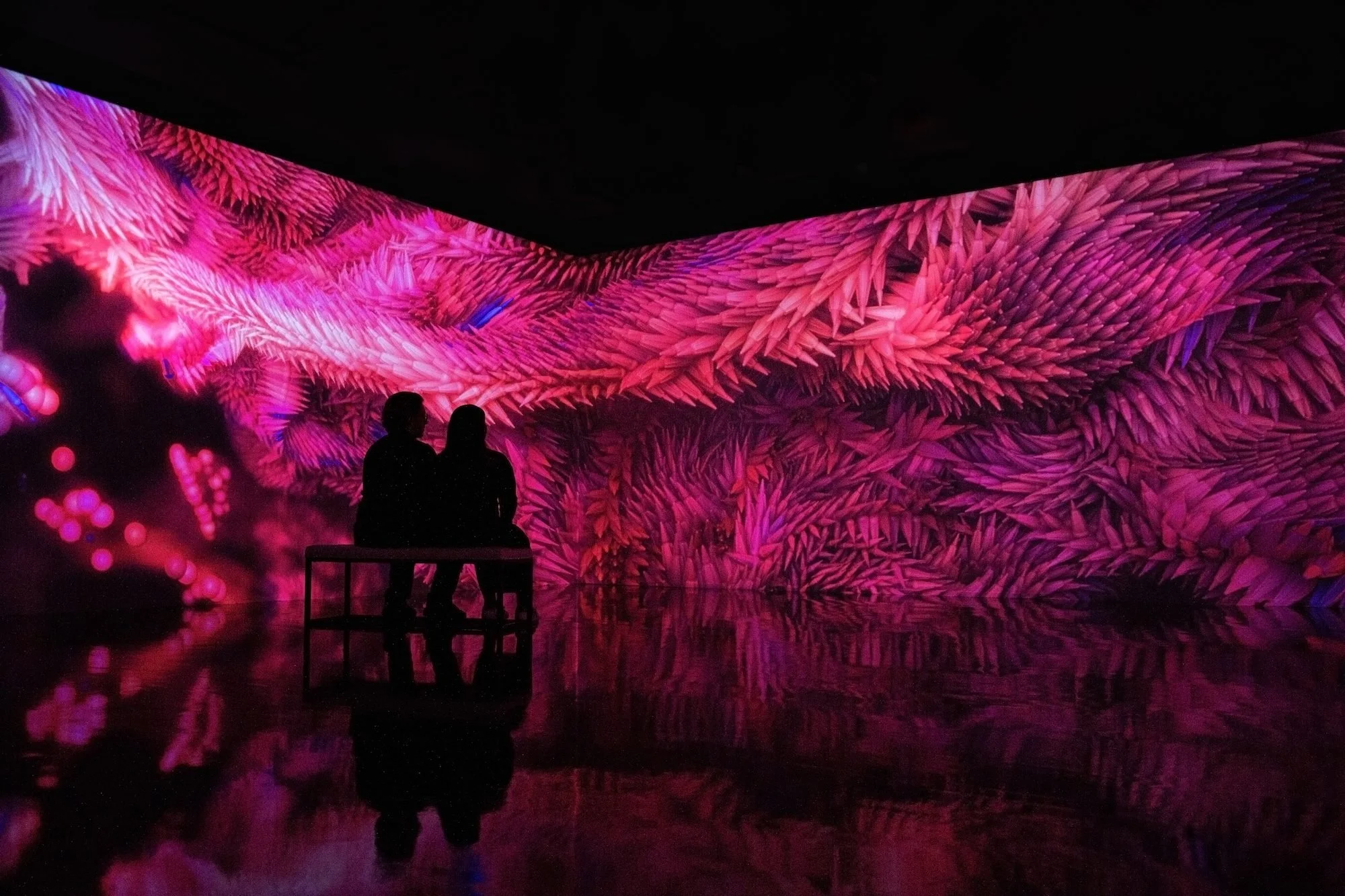
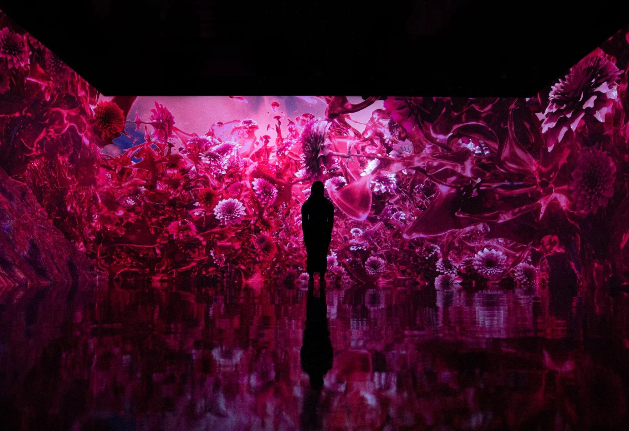
We found success when playing with humanized elements as the story behind Viva Magenta talks about humanity resilience after hard times and how can we discover new ways of navigating life.
The client liked the resemblance of an human face on these explorations with organic materials. From there, we retouched the image to create iterations until the final image was approved.
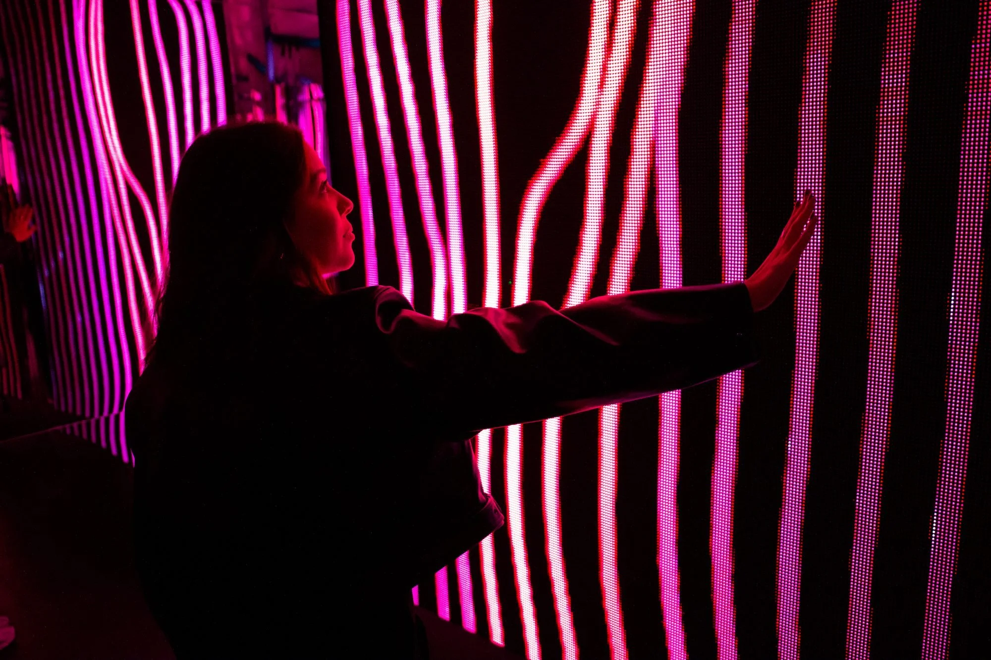
Artechouse Studio (MIA) also created a multisensory experience to help visitors explore their own feelings and emotions associated with Viva Magenta based in our designs and creative concepts.